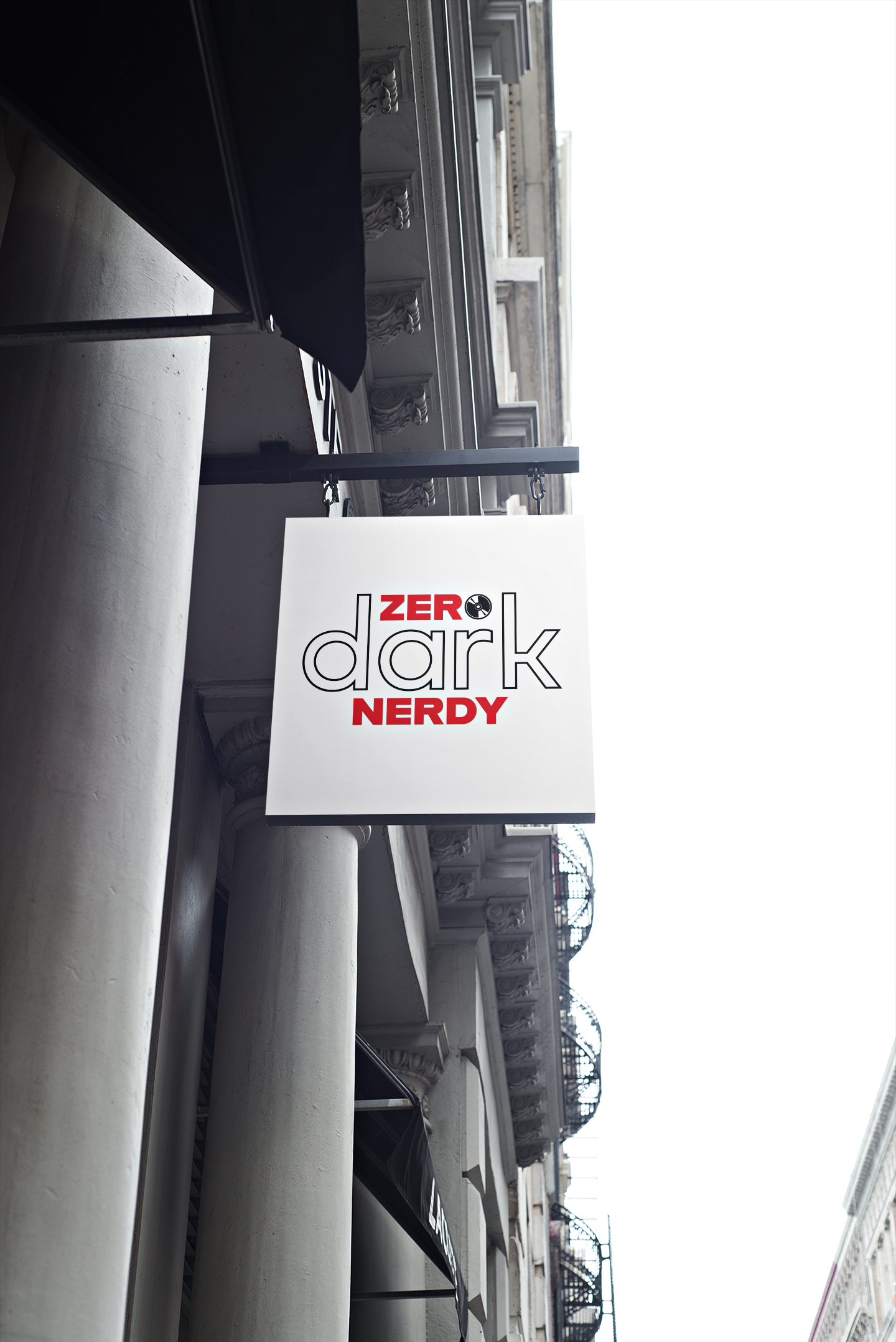
OVERVIEW: When the creators of Zero Dark Nerdy reached out for a new podcast logo, I knew I was working with something special. This wasn't just another entertainment show—it was a passion project that dived deep into the intersection of pop culture, gaming, and geek culture with an edge. The name itself told a story: "Zero Dark" hinting at intensity and depth, while "Nerdy" celebrated the unapologetic love for all things geek. They needed an identity that could capture both sides of that personality—bold and approachable, serious yet playful.
The challenge was creating a mark that stands out in the crowded podcast landscape while authentically representing their unique voice. The breakthrough came when I realized the perfect metaphor was right there: a CD. This choice was intentional—a CD bridges the gap between classic audio culture and the digital podcast world they inhabit.
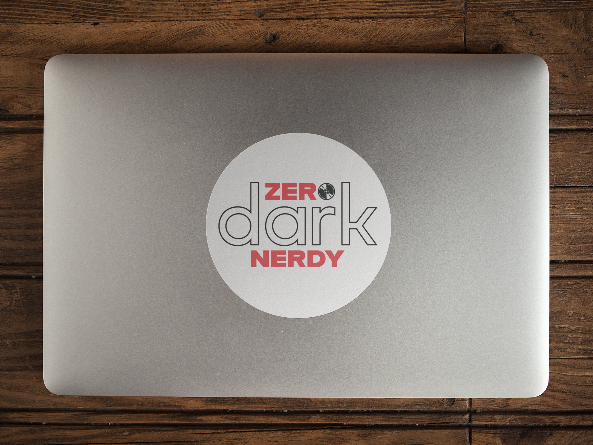
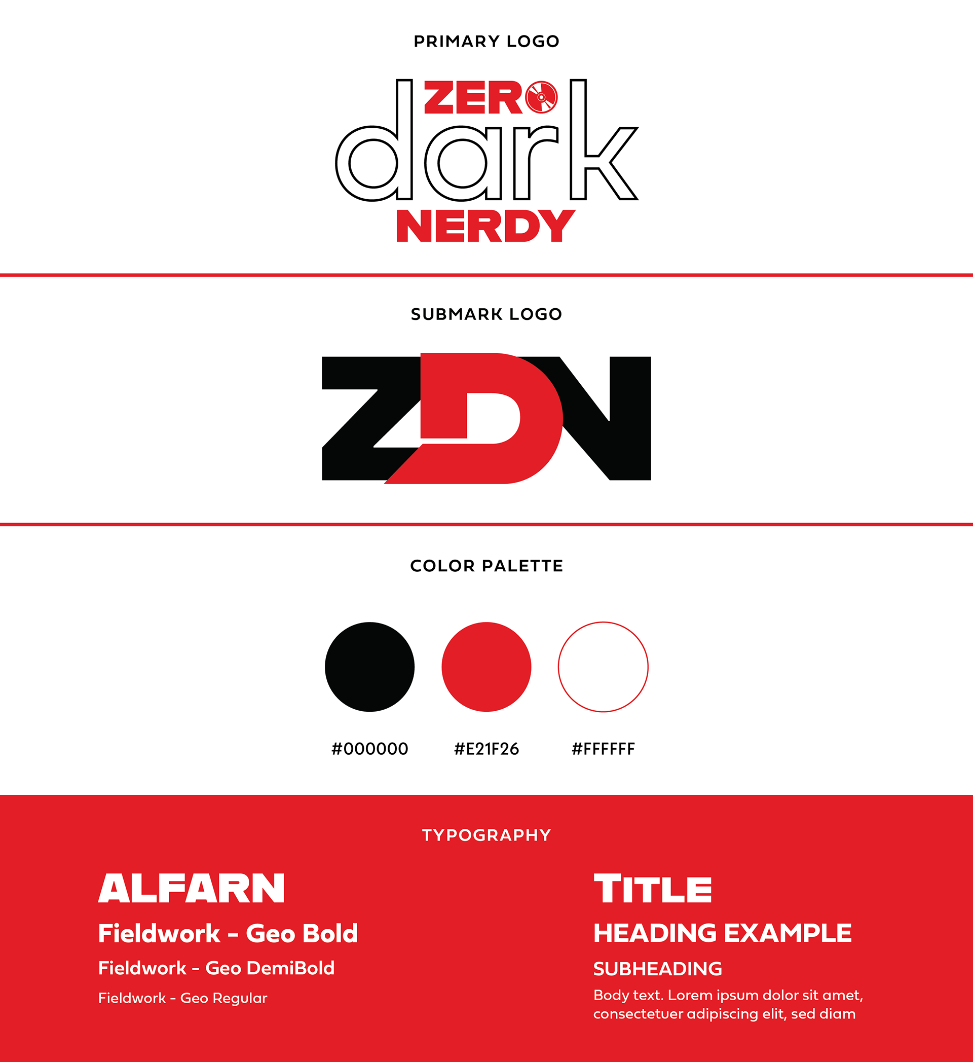
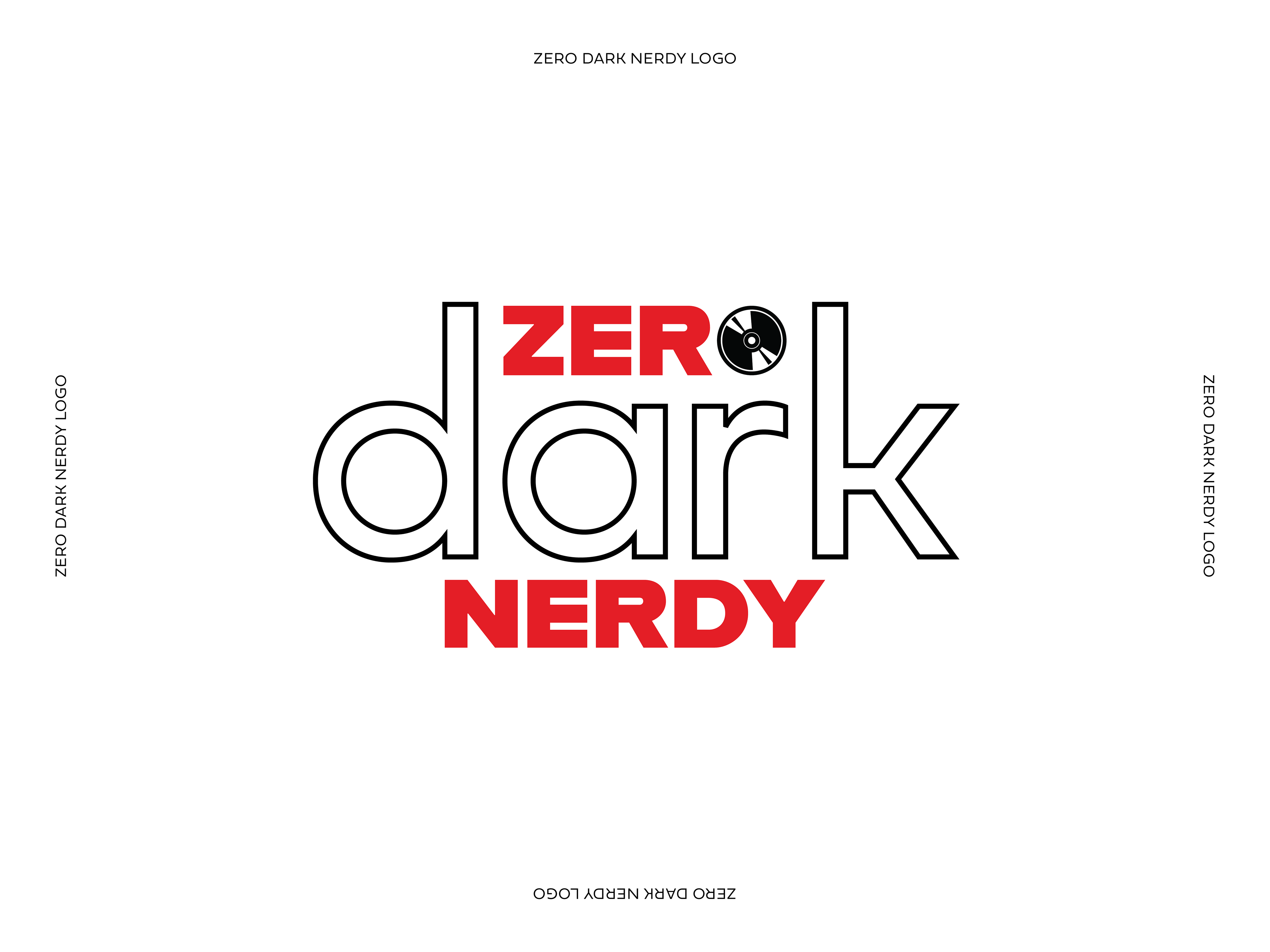
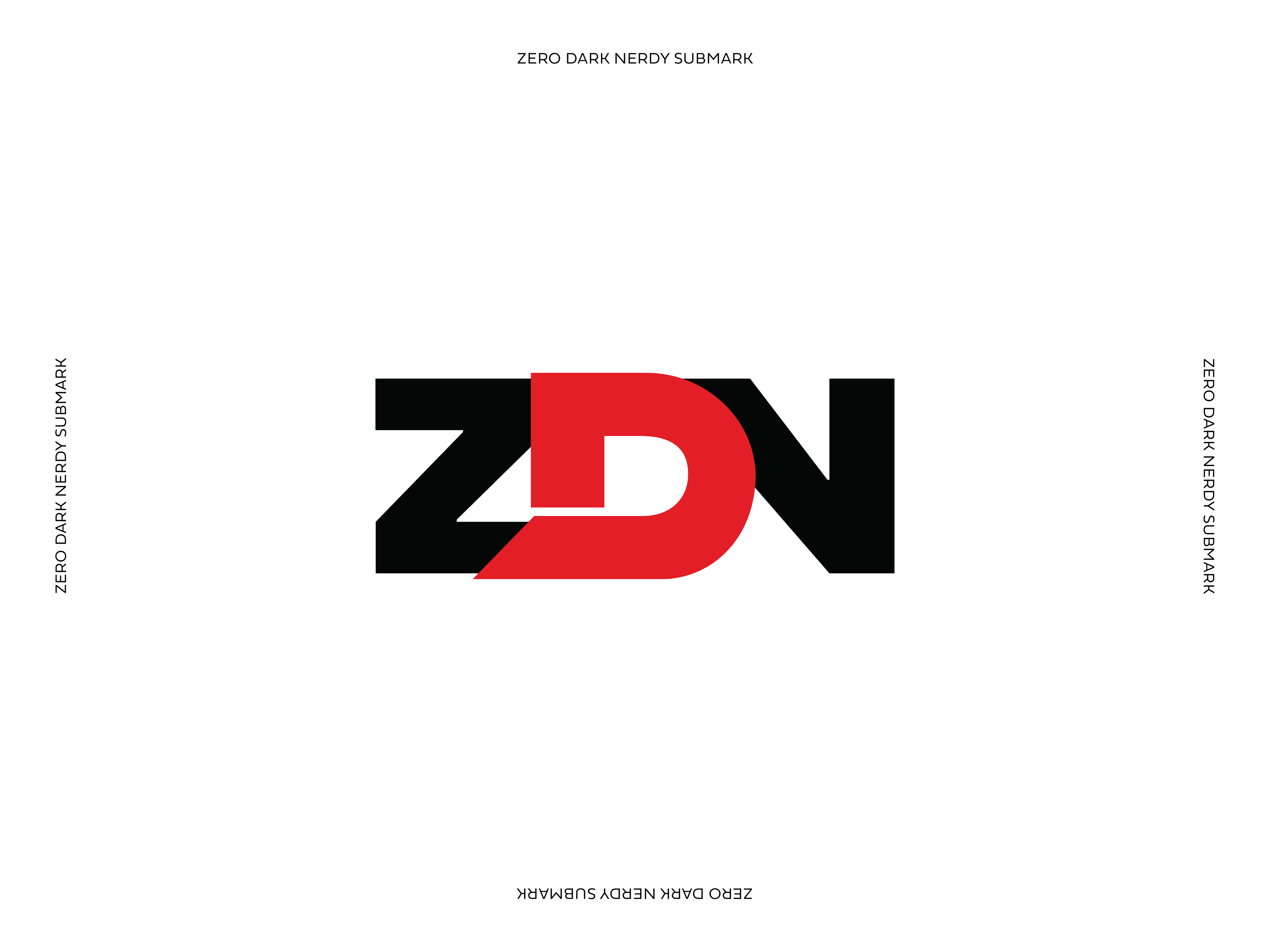
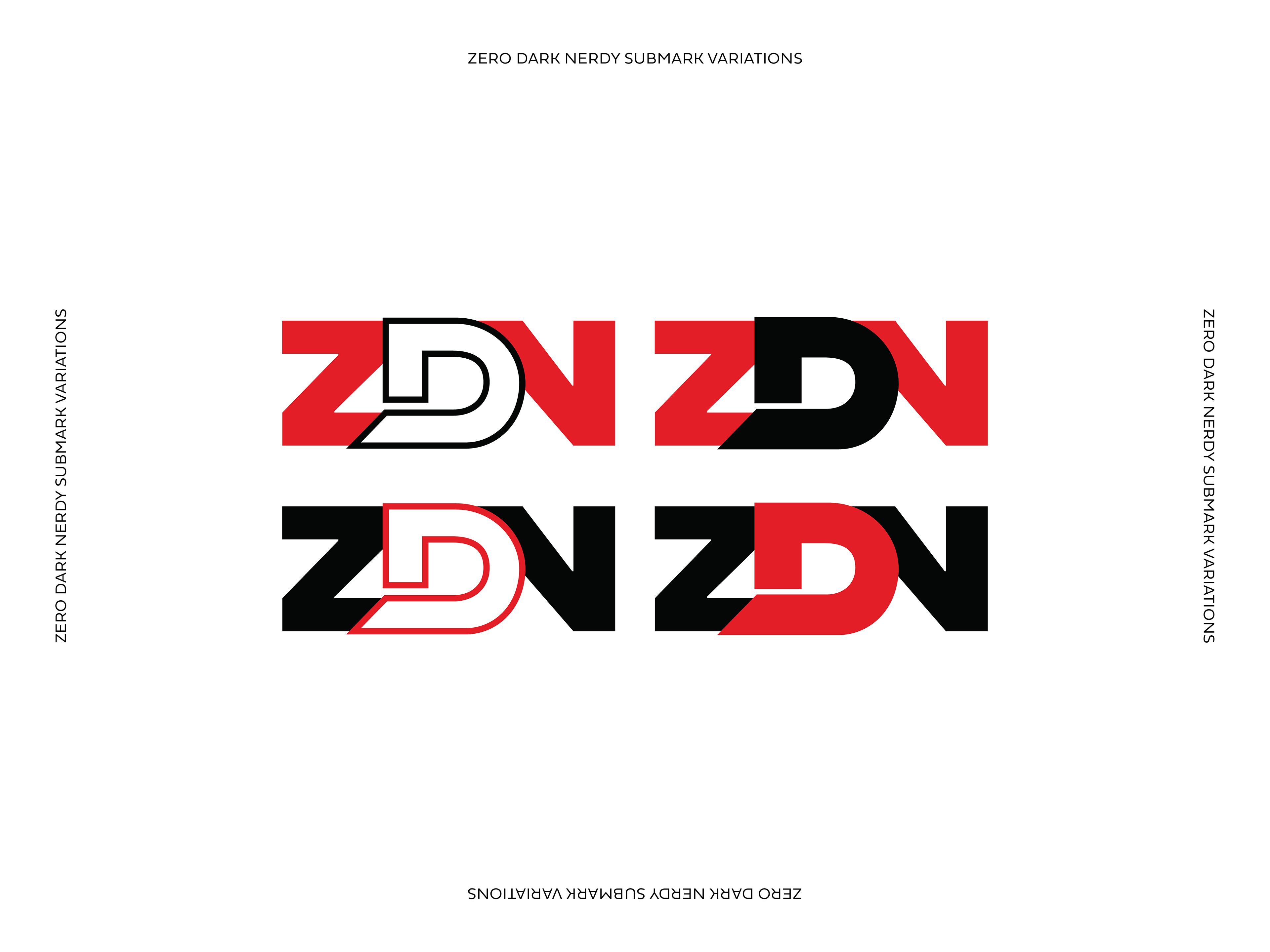
The final design centers around this CD as the "O" in "ZERO," creating an ownable brand element that's both functional and meaningful. The bold red typography demands attention on podcast platforms, while the sleek black lowercase "dark" provides visual breathing room and sophistication. This deliberate contrast—red capitals against black lowercase—mirrors the show's own duality of high energy and thoughtful depth.
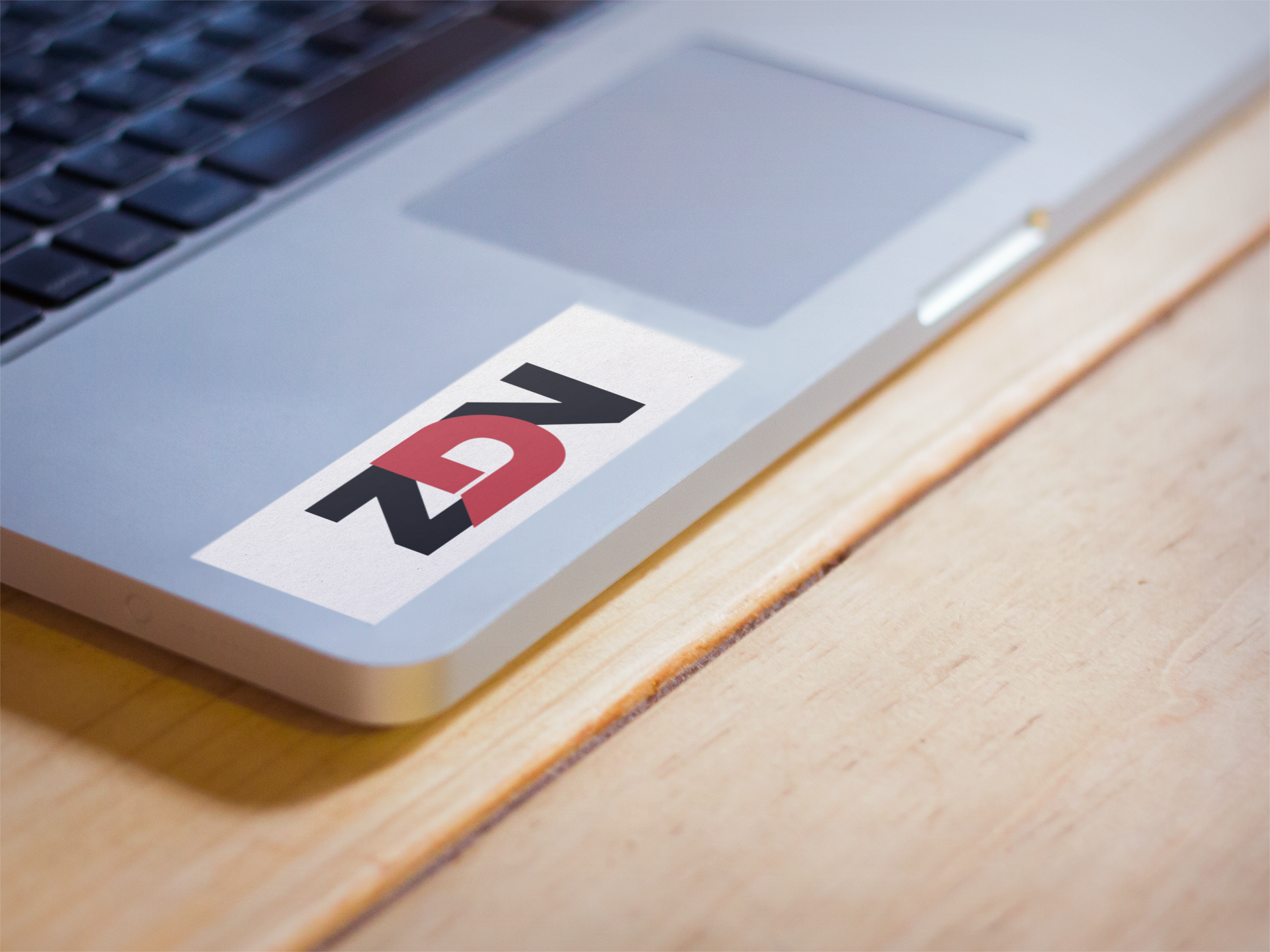
Every element was crafted with podcast-specific needs in mind: the design remains legible at tiny social media sizes, pops on dark backgrounds, and creates instant recognition whether it's a 3000x3000 podcast cover or a small YouTube thumbnail. The result is an identity that doesn't just look good—it works hard across every platform where Zero Dark Nerdy connects with their community.
MEDIUM: Digital Design, Digital Illustration