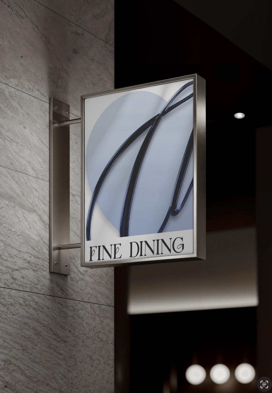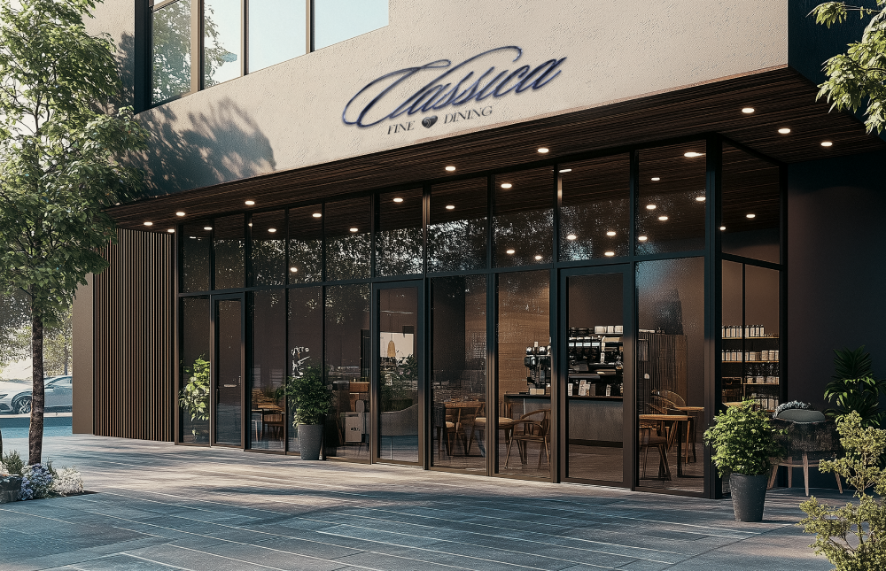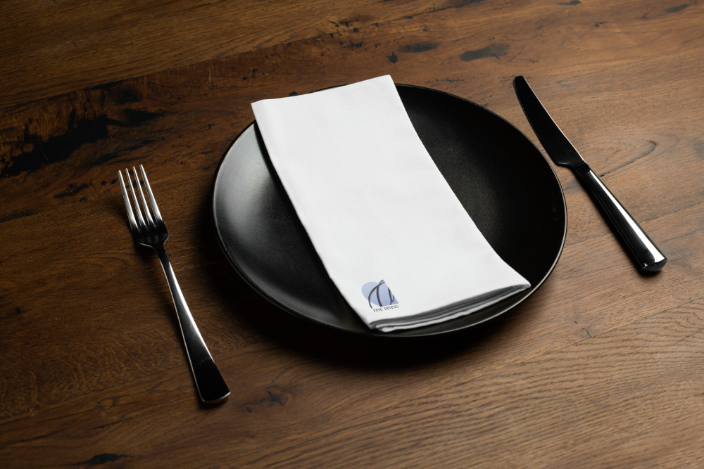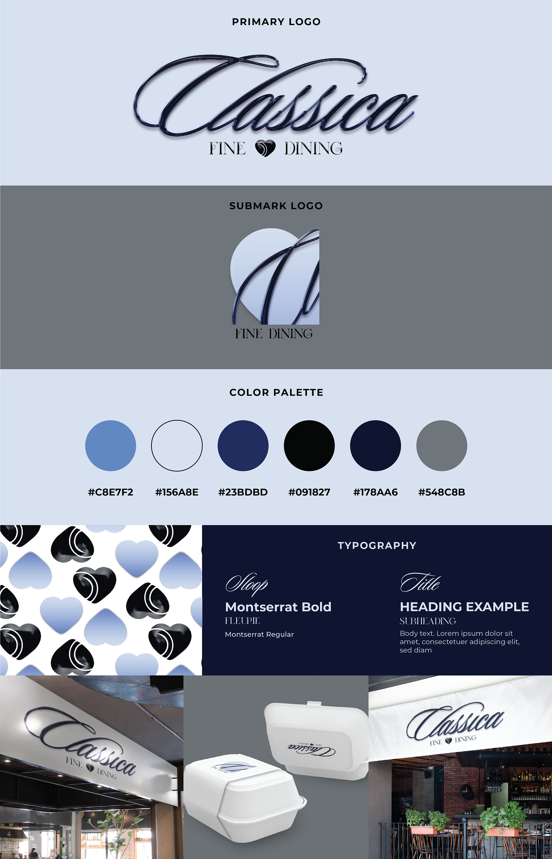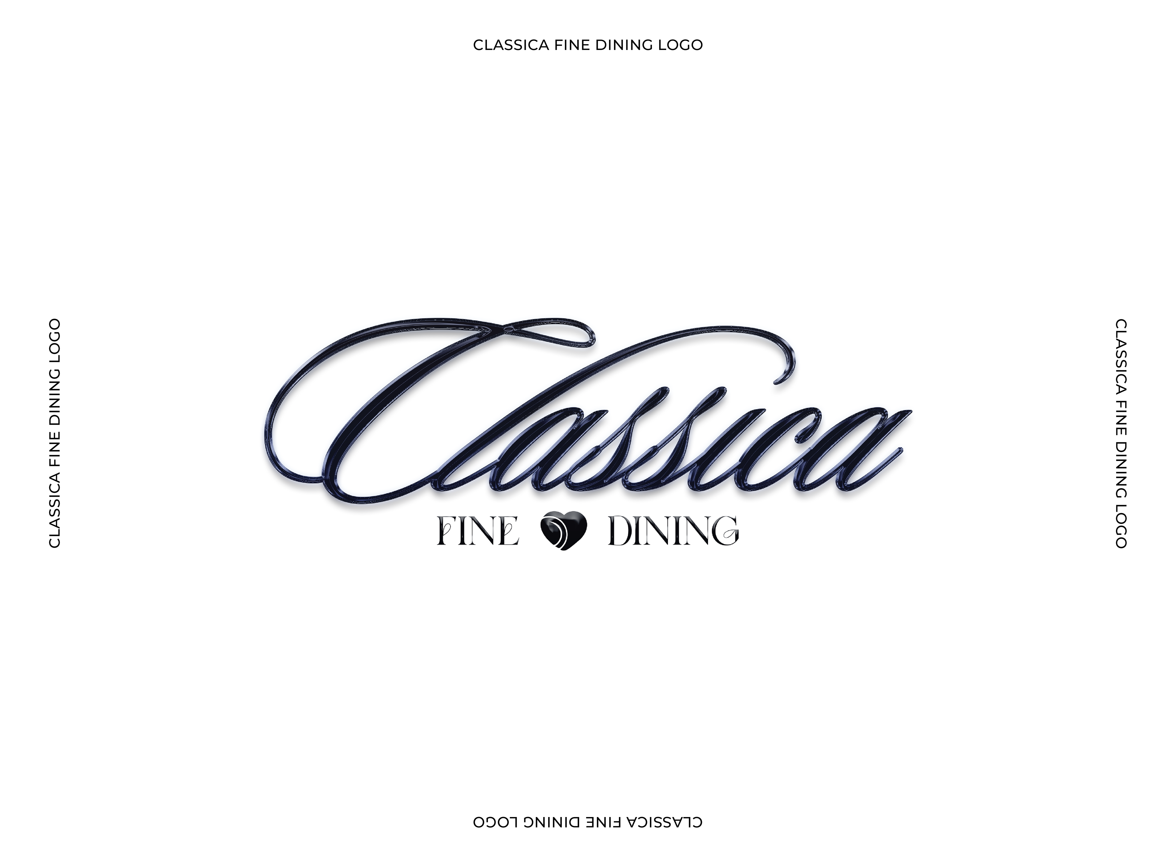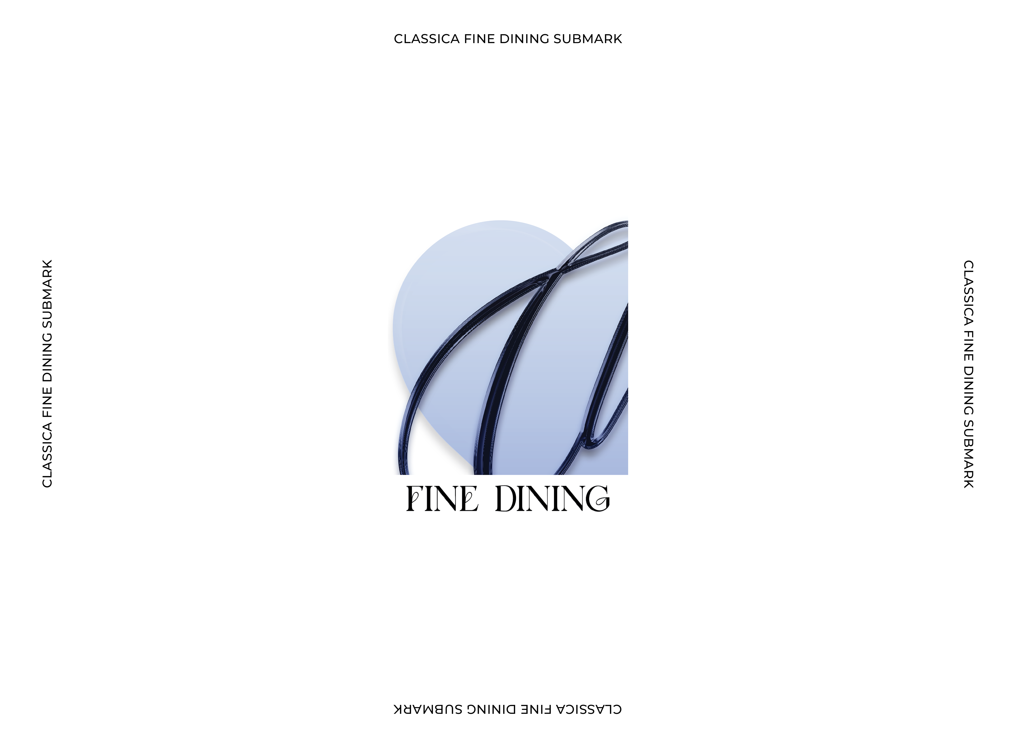

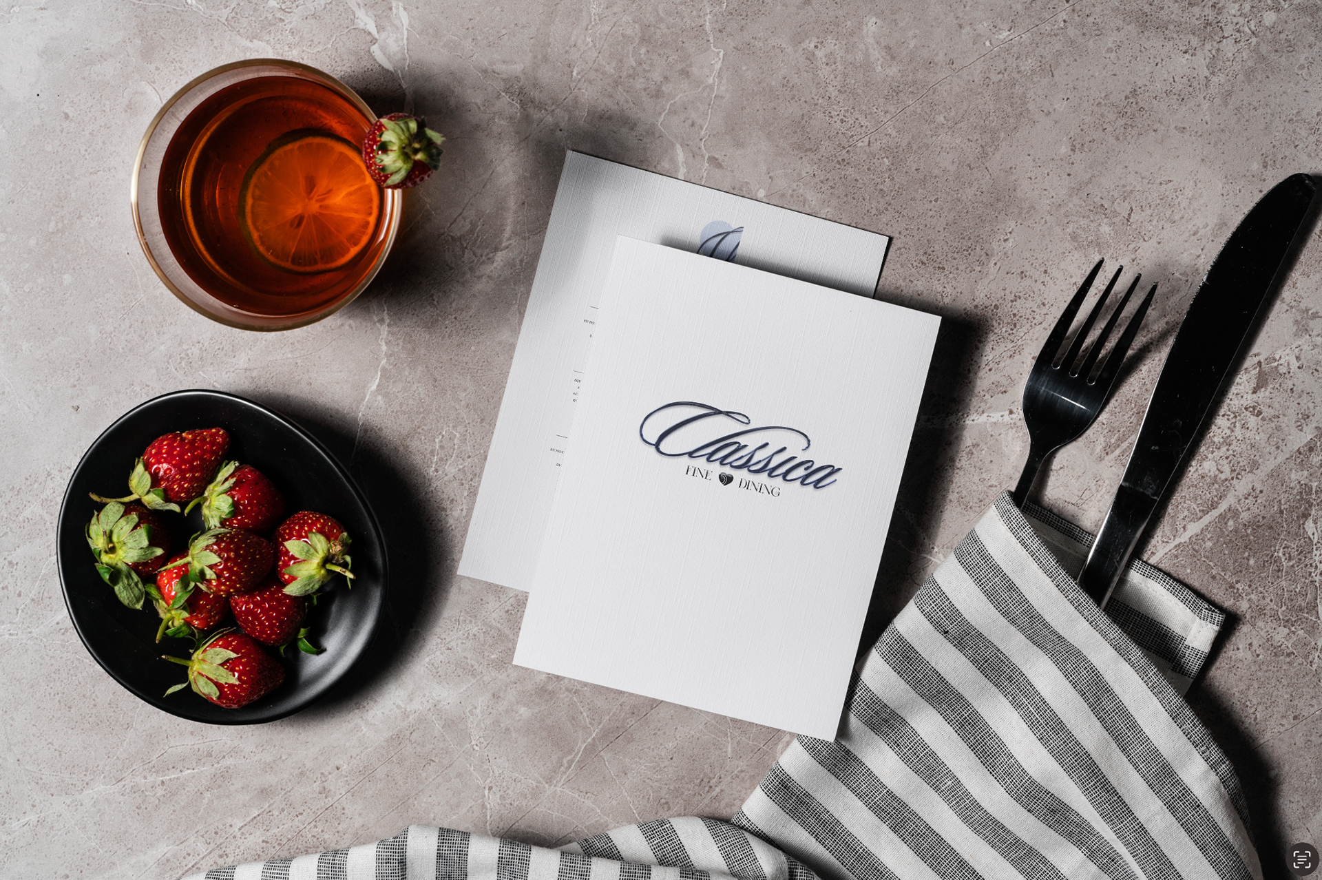
OVERVIEW: When creating this elegant brand identity for Classica, I aimed to capture the essence of fine dining that is both special and unpretentious. The logo features flowing script typography with subtle flourishes, conveying the upscale nature of the establishment while remaining approachable. A distinctive heart symbol placed between 'Fine' and 'Dining' adds a touch of warmth to the refined aesthetic. The navy and powder blue palette feels fresh yet timeless, moving away from the expected black and gold often seen in upscale restaurants. The comprehensive brand system includes primary and secondary logo variations, a custom pattern featuring geometric shapes and heart motifs, and various applications across signage and packaging.
The pattern I developed plays with geometric shapes and the heart motif, creating a contemporary backdrop that works beautifully across applications—from storefront signage to takeout containers. I'm particularly pleased with how the logo maintains its sophisticated presence even on practical items like to-go packaging, ensuring that the Classica experience extends beyond the restaurant walls.
MEDIUM: Digital Design