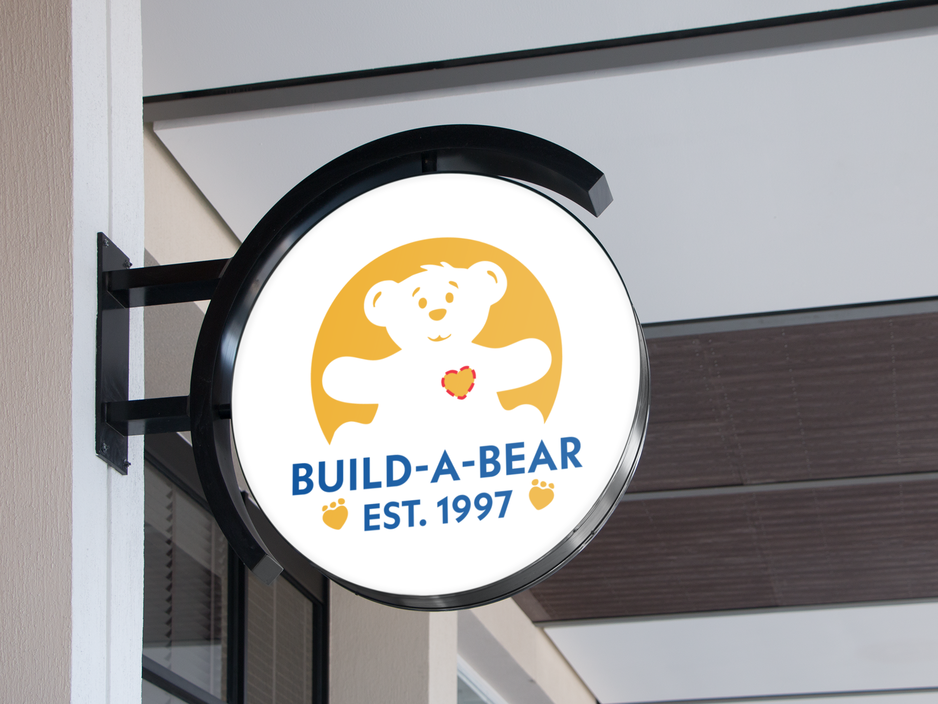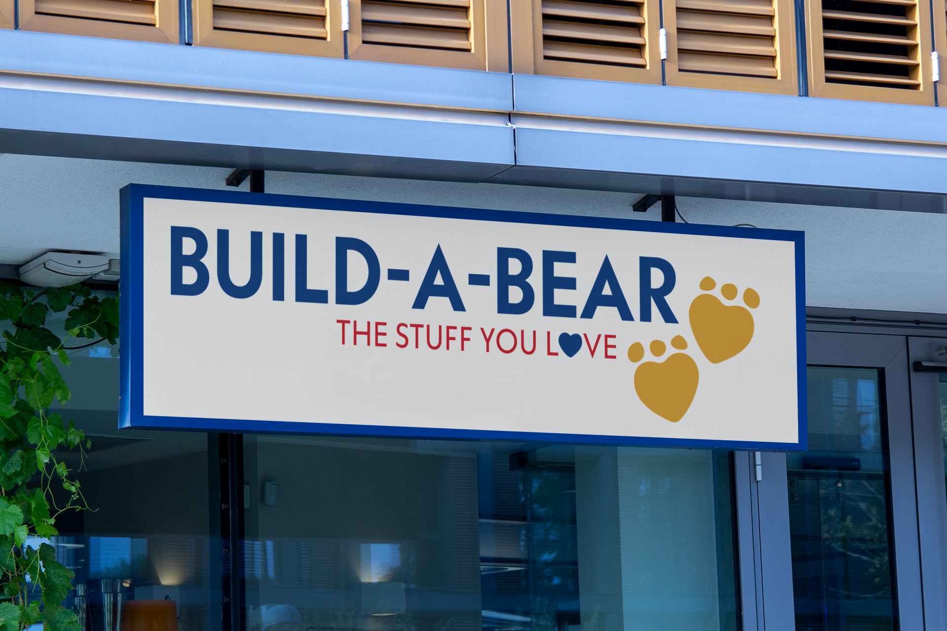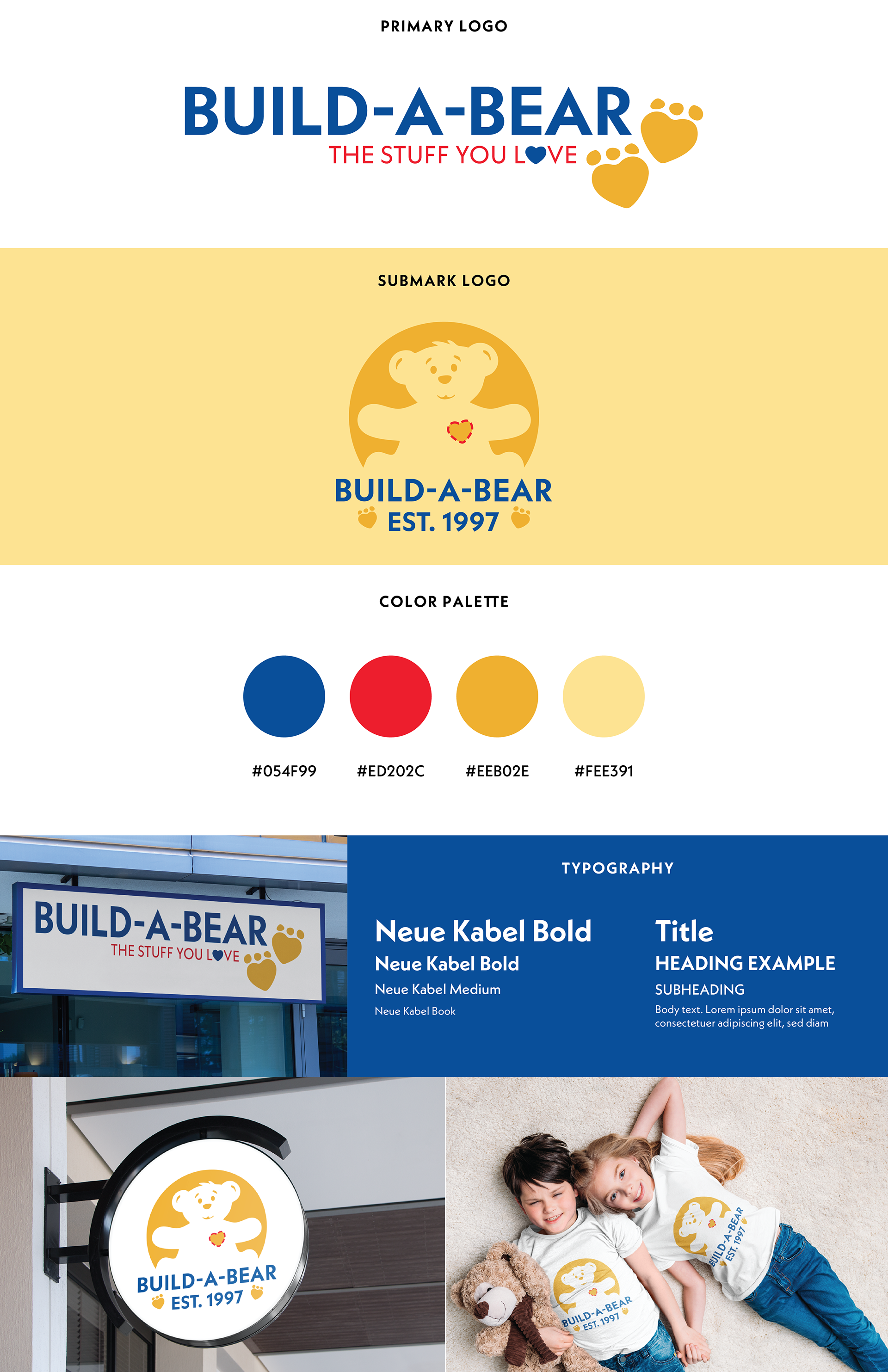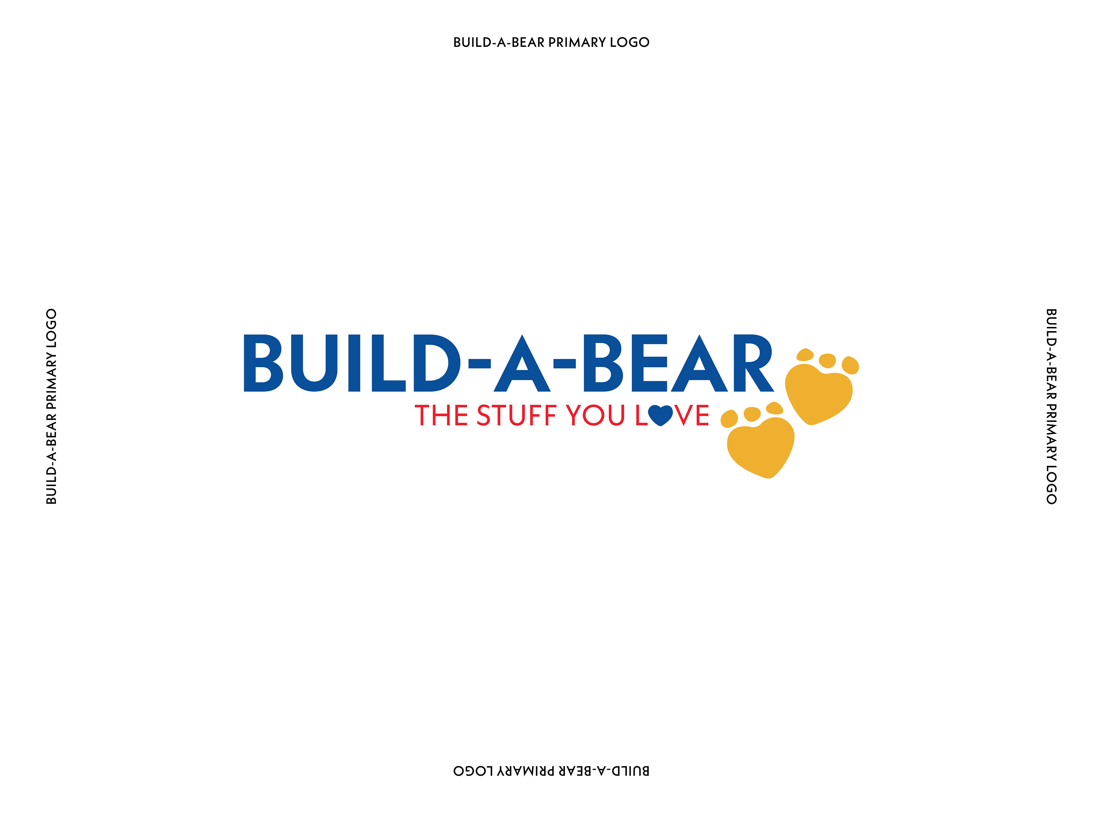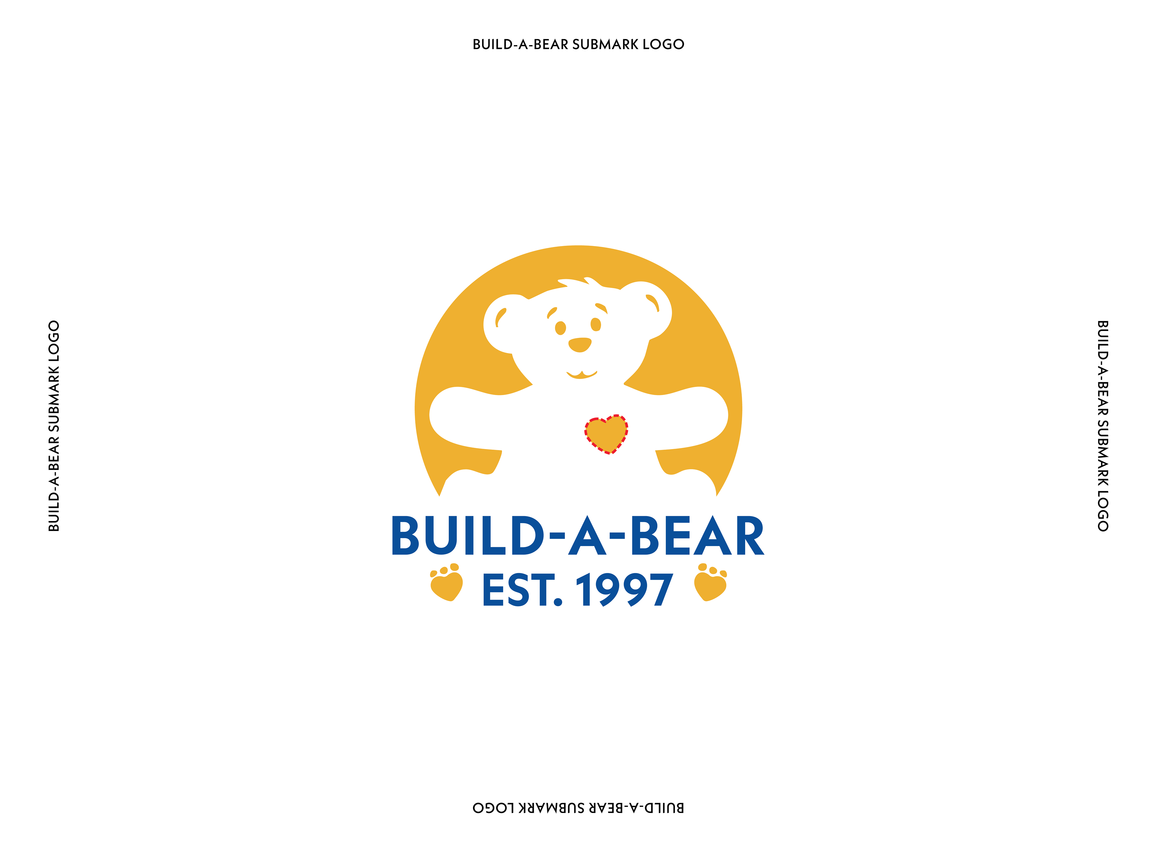
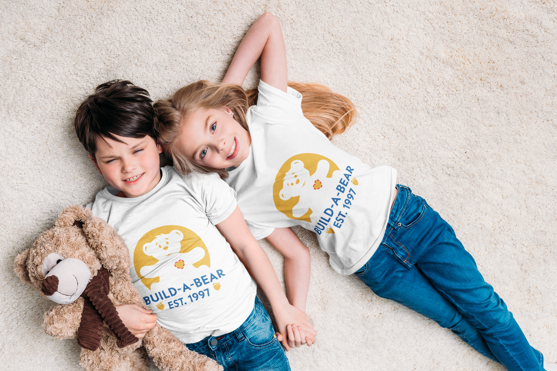
OVERVIEW: When tackling this concept project, I wanted to capture that special feeling we all get walking into a Build-A-Bear Workshop—that mix of excitement and warmth that's stayed with the brand for over 25 years. I kept the instantly recognizable blue and yellow colors (they're just too perfect to change!), but gave everything a fresher, cleaner look. The main logo uses bold, friendly letters with playful hyphens that hint at the step-by-step building experience. I enjoyed replacing the 'O' in 'LOVE' with a little blue heart—a nod to that magical moment when kids place a heart inside their new friend. For the circular emblem, I created a simplified bear with open arms that feels like it's ready for a hug. The stitched heart detail on the bear's chest is my favorite touch—it references the signature ritual that makes each Build-A-Bear creation personal and special.
The whole redesign was about finding that sweet spot between modern retail appeal and the genuine emotional connection that's made Build-A-Bear a beloved brand since 1997. I wanted a logo that would make both kids and nostalgic adults smile!
MEDIUM: Digital Design, Digital Illustration, Digitized Repeat Pattern